Fandom across baseball consists widely because of favorite players, team locations and success. Another element that decides which team fans flock to are uniforms.
Seeing pinstripes, bold colors, custom fonts, interlocking logos, and different color patterns across the diamond are some of the best sights in sports.
So what makes a good uniform? Is it the tradition? The modern style? The colors?
While the start date of the 2020 MLB season is currently unknown, some new uniforms have already been revealed. The changes will vary across the board as some uniforms take a journey back in time, while others will be a completely new and modern look.
Looking at the team’s colors, tradition, uniform style, uniqueness, logo, cap, home uniform, away uniform, and alternates, here is every MLB uniform ranked from 1-30.
Note: No throwback uniforms are considered; only current styles.
30. Detroit Tigers
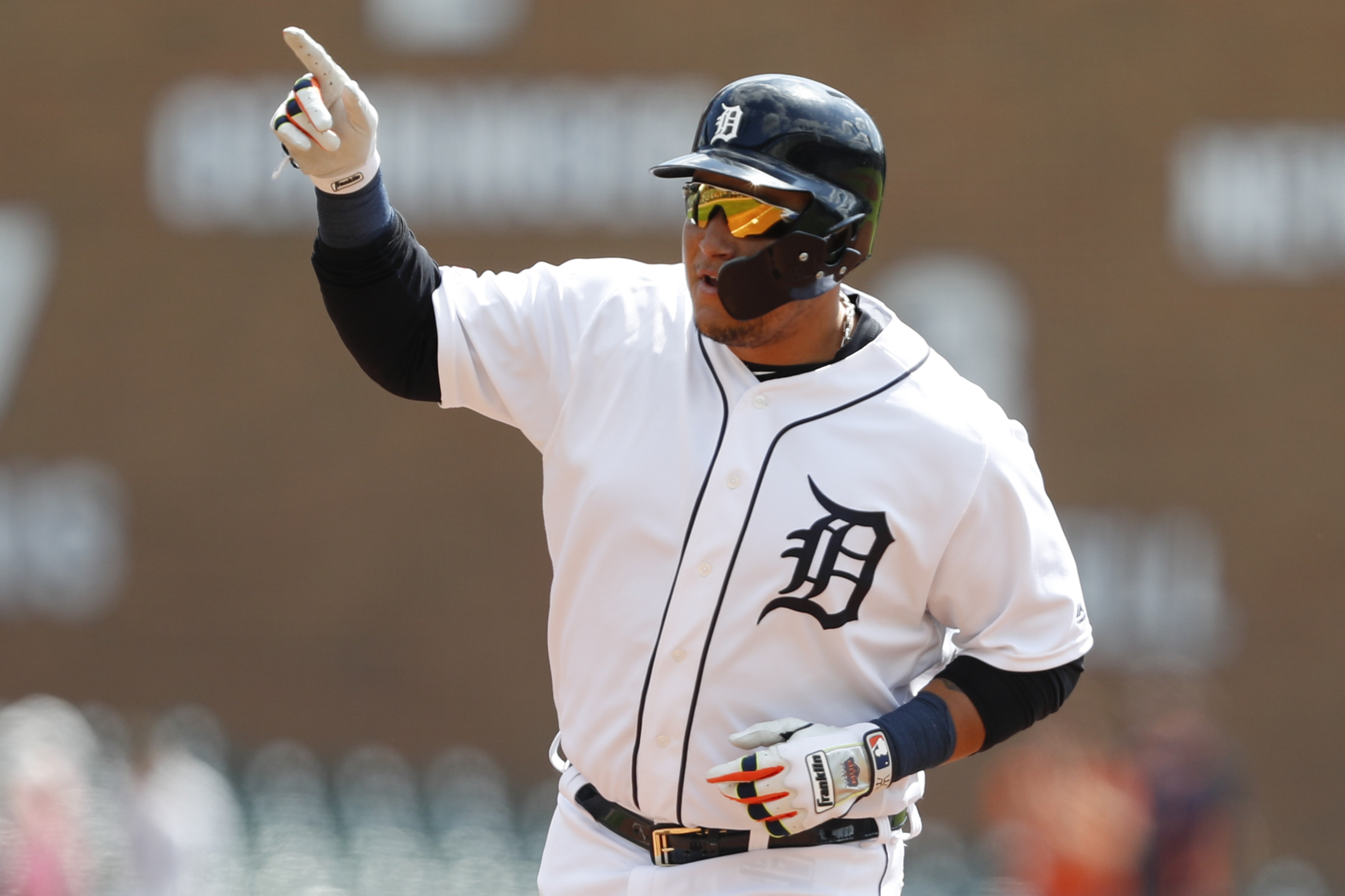
The Tigers just haven’t updated their uniforms in, well, forever. The old school English-style “D” has been used since the dawn of time. While the Tigers’ colors are orange and navy, the orange isn’t used as it should be in the home uniforms and very minorly in the away. As of 2020, Detroit has no official alternate. These are the blandest uniforms in baseball.
29. Cincinnati Reds

The Reds have a traditional uniform set that tries to be modern without the addition of modern elements. The old-school “C” logo, the same as the NFL’s Chicago Bears logo, is used on every cap and the chest of the home jersey. The simple colors of red and white are used in 2020 with basic scriptwriting, rather than the red and black that were used in the late 1990s and early 2000s. This one is simple and bland.
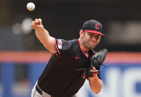
28. Cleveland Indians

The Indians have a lost identity in 2020. With the elimination of one of the greatest logos in all of the sports in Chief Wahoo, Cleveland has gone with the bland block “C” as their primary logo. Their home primary and alternate consists of script “Indians” wordmark, while their away primary and alternate consists of what seems to be plain Arial font that says “Cleveland.” Cleveland’s old-school unis featured in the movie series Major League need to make a comeback alongside their 2016 World Series appearance navy jerseys and Chief Wahoo logo.

27. Los Angeles Angels

The Angels’ uniforms are just odd. The “A” logo with the halo is a great logo but the wordmark on the jerseys is spaced oddly. Going from light blue and navy in the 1990s to just red and maybe navy or silver (although the two colors are very minorly used with their primary red) was a bad choice. There are too many red teams in MLB and the Angels’ red numbers on the red alternates are confusing and hard to read. Go back to the old-school light blue, Anaheim.
26. San Francisco Giants

The Giants’ uniforms could be much better. With orange and black as their colors, the Giants don’t use the strong color combo to their advantage. The cream uniforms as their home-style seem very odd with orange and the color isn’t implemented at all. The interlocking “SF” logo is one of the strongest in baseball but the lack of identity in their jersey styles and colors is what makes the Giants’ uniforms so low in the ranking. Use orange more and wear the black alternates more, San Fran.
25. Texas Rangers

Despite new uniforms in 2020, the Rangers continue to lack identity. The only thing making Texas this high on the list is the addition of the all light blue uniform. Still, this style is a bit overused in MLB right now. The Rangers have an identity crisis. Are they royal? Are they red? Are they light blue? The script font with the custom “T” logo seems weird. Six uniforms also seem a bit much for an MLB team. Figure it out.
24. Los Angeles Dodgers

The Dodgers as No. 24 on the list will create a lot of hate but it’s true. The Dodgers’ uniforms are simple and traditional but very bland. For a franchise that doesn’t have a long history of winning culture, the locked-on traditional style feels weird. With just white and gray uniforms, the great interlocking “LA,” and the plain script across the front, switching from “Dodgers” to “Los Angeles” at times is just odd. The raised new helmet logos help a little bit but quite frankly, the royal spring training Dodger jerseys are far superior to their beloved home and aways. You have “Dodger blue,” so use it more!
23. Tampa Bay Rays

The Rays, like most teams ranking in the last 10, lack identity. Are they the sunshine Rays or the Devil Rays? The colors navy and light blue are unique but the current jerseys are not. Bland navy, white and grey are used as their official uniforms. The alternate throwbacks and Players’ Weekend uniforms are just simply better. Tampa needs to play with light blue and yellow more. The implementation of the new Devil Ray alternate throwback that is green, navy and light blue makes for an odd combo. Identity, identity, identity.
22. Chicago White Sox

The White Sox have a pretty simple uniform set. With black and white as their primary colors, it’s hard to make a bold statement. The black pinstripes on the home uniform is actually a pretty good look. The black alternate that says “Sox” on the chest is organized and neat. The away grey that says Chicago in script is pretty simple as well. The Sunday alternate’s in navy and red throws off the black and white main colors and make the uniforms rank low on the list. Are they the White Sox or the Red/ Navy Sox? There’s nothing really wrong with the White Sox uniform set beside their lack of color.
21. Arizona Diamondbacks

Identity. The overused term is what another team is missing. The Diamondbacks messed up when they went from purple and teal to red and black. Slightly new uniform styles arrive in 2020; the red and black are still here with the slight implementation of the weird light blue or teal color in two alternates. The D-backs’ uni set is okay, but it doesn’t stand out like the purple and teal throwbacks. They won a World Series in the purple and teal, so why change?
20. Miami Marlins

The Marlins just don’t know what they’re trying to do. Changing their uniforms is something the franchise has done quite often since 2000. Going from their awesome teal and black “Florida Marlins” color scheme to orange and aqua blue, Miami changed their uniforms again in 2019. Now aqua and black with a hint of orange, the Marlins have tried for a very modern look but its unclear if this worked out. The new logo seems congested and squished, yet still sort of pleasing. Regardless, bring back the teal.
19. Colorado Rockies
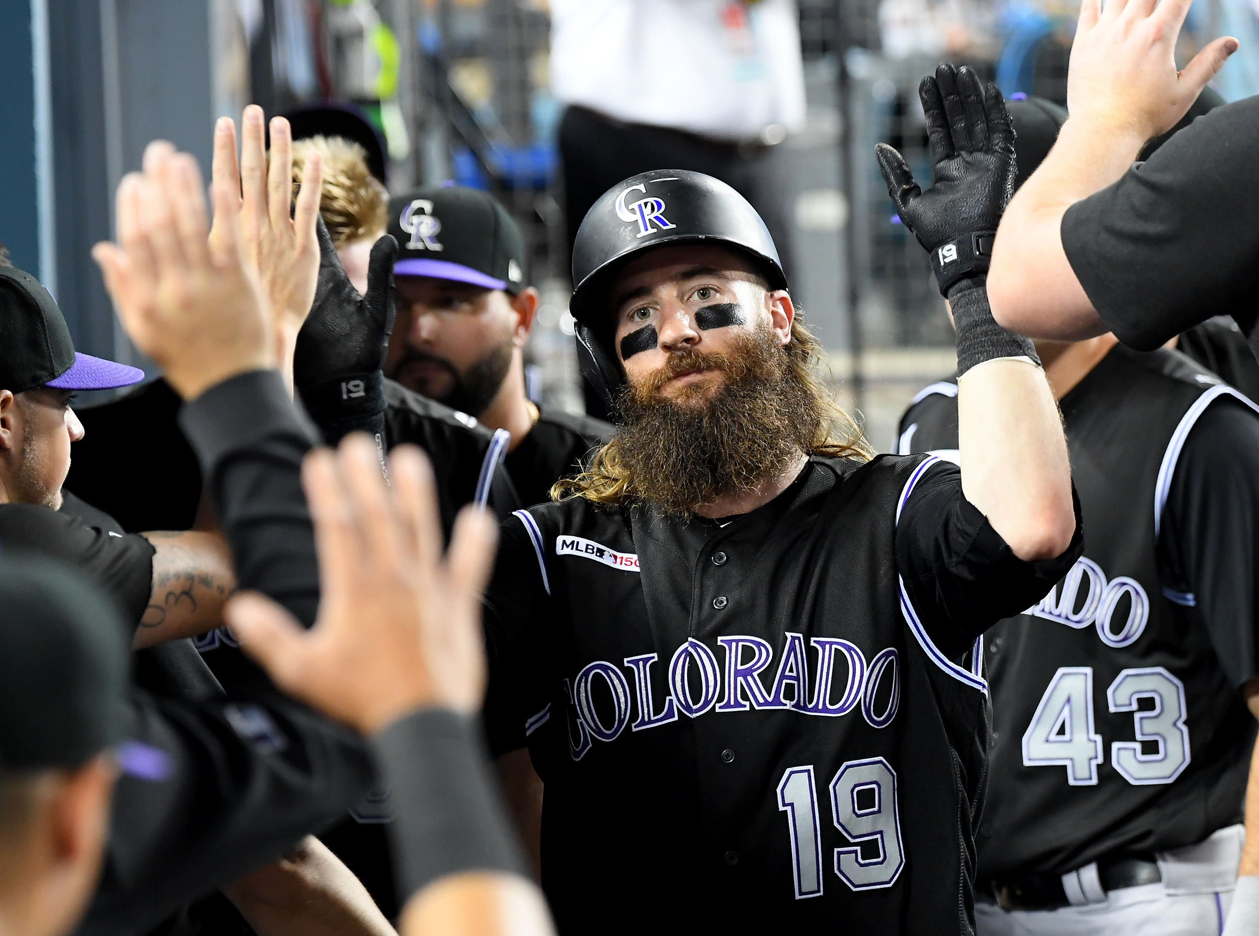
Purple. The Rockies are the only team in MLB to have purple as a color and they do not use it enough. Sure, they have a purple alternate, but the home and away uniforms don’t use purple as they should. The interlocking “CR” is probably the most unorthodox interlocking logo in all of baseball and just doesn’t look good. The implementation of their Rockie mountain logo should be used instead. The black vest jerseys seem intimidating but vests seem like softball jerseys. The black pinstripes on the home uniform don’t seem right … and again, purple needs to be used a lot more.
18. Houston Astros

The Astros are a bit tricky. With the new orange and navy color scheme, the uniforms still seem to be bland. The “H” logo with the star is one of the best in the game but the bland Arial style “Astros” and “Houston” across the uniforms don’t seem right. With possibly the best throwback uniform in all of the sports, the sunset jerseys need to be permanent. If Houston implements the sunset theme more often, the uniforms would be banging. (Get it?)
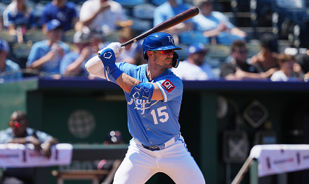
17. Kansas City Royals

The Royals have a great interlocking “KC” logo. The script “Royals” and “Kansas City” just seems a bit simple and bland. Limiting the use of light blue with the royal is one of the worst things the Royals could have done. The light blue with the royal is such a great color scheme. Kansas City needs to go back to the Bo Jackson and George Brett era style of uniforms. If there’s any team in MLB that needs to have all light blue uniforms, it’s the Royals.
16. Seattle Mariners

Teal. The Mariners are this high on the list because of their teal color. While they don’t use it as much as they should, the simple nautical style script font and “S” logo make their uniforms stylish. With white and navy in their home and grey and navy in their away, teal is not used enough. The teal alternate jersey that the Mariners use occasionally is one of the best jerseys in the league. The alternate yellow and royal alternate throwbacks seem odd to the uniform set. Nevertheless, more teal is needed in their two primary jerseys.
15. New York Mets

The Mets have a traditional yet modern uniform set. The home blue pinstripes are a nice look with the orange. The away greys with royal as the main wordmark color works but pinstripes are needed on those, too. The royal alternates with the silver writing and orange outline look very clean. As some players like Pete Alonso have iterated, the old-school black uniforms with the blue accent colors are much needed. Overall, this is a solid uniform set for the Mets.
14. Washington Nationals

The Nationals were brought to the forefront in 2019 during their surprising World Series championship run and so were their uniforms. The new addition of the navy jersey with the script white “Nationals” and red outline made for a very clean look. The alternate jerseys that have stars and stripes in the curly “W” logo are awesome. The implementation of stars and stripes and a possible secondary Eagle logo, representing the nation’s capital to go along with the “W,” would make sense.
Fun fact: The last four World Series champions have clinched wearing an alternate style jersey:
- 2019: Nationals in navy.
- 2018: Red Sox in navy.
- 2017: Astros in orange.
- 2016: Cubs in royal.
13. Toronto Blue Jays

The Blue Jays have done a terrific job of implementing a modern look with their old-school traditional style. The custom font and old school Blue Jays logo with the Canadian maple leaf is a nice touch. The home whites, road greys, and alternate royal jerseys are clean. In 2020, Toronto is adding an all light blue alternate/throwback that will add a nice look to their uniform set alongside the red jerseys that pay homage to their home country.
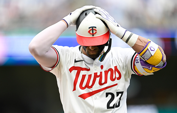
12. Minnesota Twins

The Twins have done a really good job of modernizing their uniforms. Using pinstripes in the early 2000s, Minnesota has limited the old-school look with simple yet clean jerseys. Implementing gold with their navy and deep red, the Twins’ look is sleek. In 2020, the Twins are adding an all light blue alternate/throwback to their set. While it is a bit overused in MLB, the navy and red make the light blue stand out. And of course, don’t forget the awesome interlocking “TC” logo.
11. St. Louis Cardinals

The Cardinals’ uniforms are high on this list simply because of their great wordmark. The two Cardinals on each side of the baseball bat is a great look. With the interlocking “STL” on the hats, St. Louis has one of the best classic yet up to date looks in the league. Playing with navy more, the Cardinals wear navy hats when playing another red team, which is something more MLB teams need to do for viewing pleasure. The Sunday throwback cream alternates are okay, but the need for a red Cardinals jersey, like their spring training outfit, is much needed.
10. Chicago Cubs
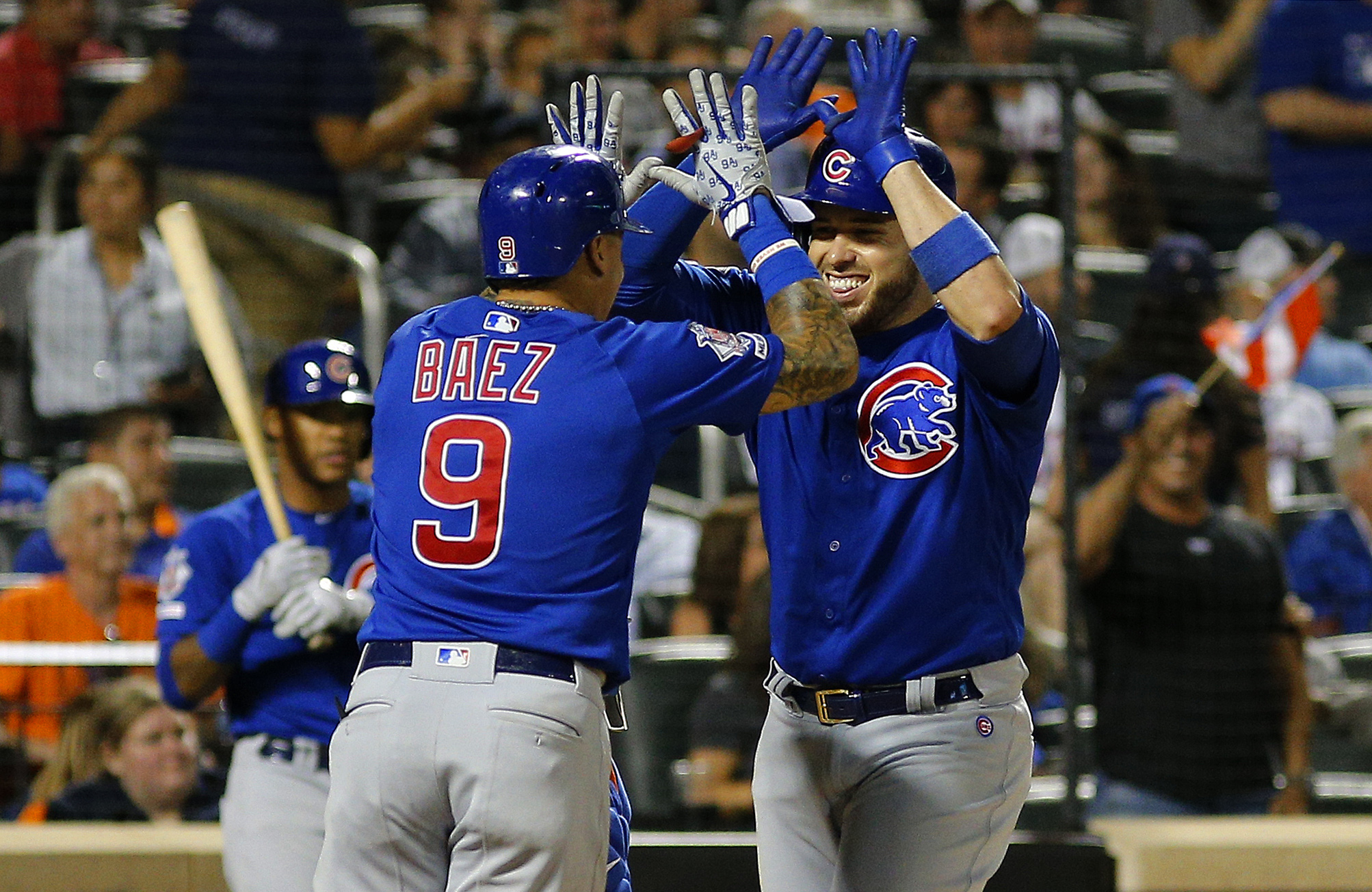
The Cubs’ royal blue pinstripes with the Cubs wordmark in a circle on the left chest is a traditional and classy look. The royal cap with the simple “C” is just clean. While the away greys with “Chicago” in the bland Arial font are basic, the alternate blues are great. The big “C” logo on the jersey with the giant cub on the left chest makes for a bold statement. Royal pinstripes are needed on the Cubs’ away grey uniforms to add a little spice but Chicago’s overall uniform set is nice and clean.
9. New York Yankees

Not putting the Yankees’ traditional uniform in the top five will certainly stir conversation but this is not a top five jersey in baseball and barely a top 10 style. While New York’s pinstripes and no player name on neither home nor away jersey are the most traditional thing in sports, it’s just very bland. Still, looking at the pinstripes and simple grey jersey with the great interlocking “NY” on the cap makes any baseball fan think of winning and the Yankees’ tradition. The need for an alternate navy jersey with the interlocking “NY” and pinstripe white pants, much like their spring training style, is needed in New York for sure.
8. Atlanta Braves
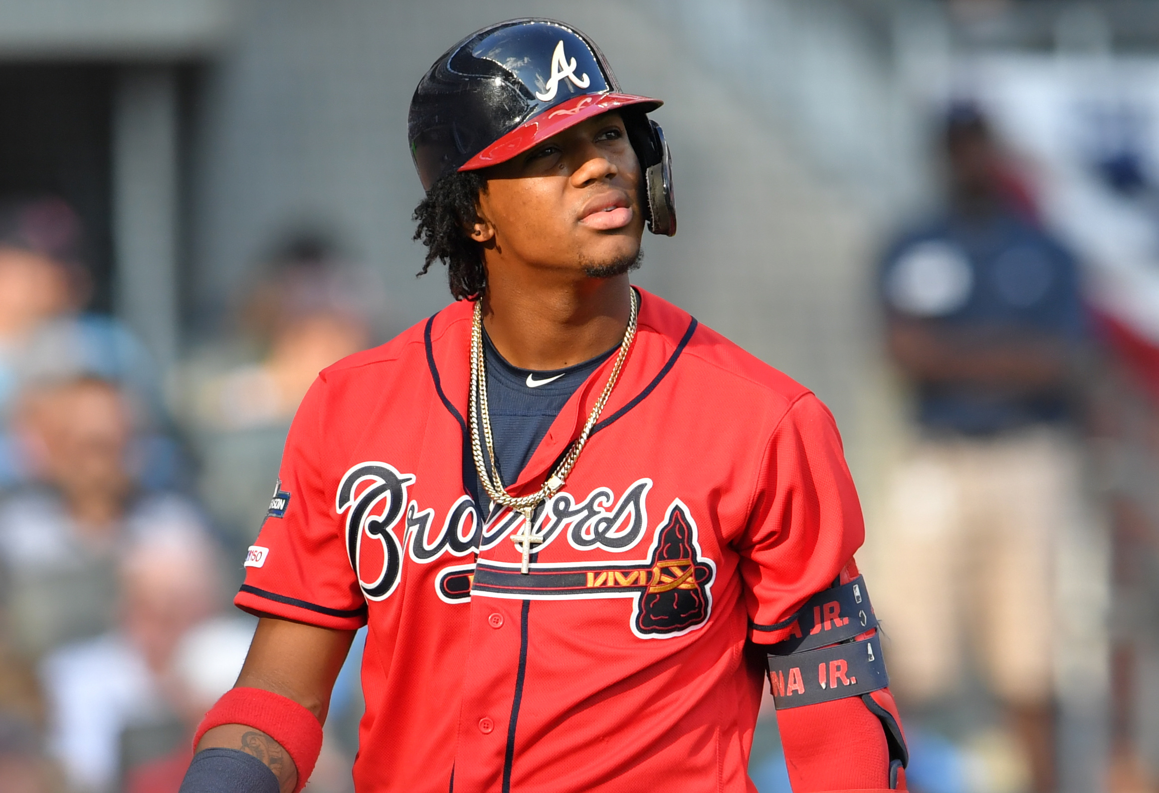
The Braves’ script “A” is one of the most recognizable logos in all of sports. The Braves’ home whites with the script “Braves” writing and tomahawk underline make for an aesthetically-pleasing uniform. The road greys are also nice with “Atlanta” on the chest and a tomahawk underline. The red alternates are one of baseball’s favorites with the alternate tomahawk through the script “A” cap. With the addition of the new navy road alternates, the Braves have a very sleek and modern uniform style that hasn’t been altered that much since the 1990s and frankly shouldn’t be altered.
7. San Diego Padres

The new old. In 2020, brown is back for the Padres. Bringing back the old school color scheme of brown and gold, San Diego’s new style is very cool. Brown is always a tricky color to make look good but the Padres have done that. The home white with brown pinstripes is by far their best in the uniform set. The away greys keep the same pinstripe style, something more teams need to do if they decide to have pinstripes. The alternate brown is okay but the need for yellow pinstripes on those are crucial. The Padres also have two alternate dessert camo style jerseys paying tribute to the strong military connection to San Deigo. Well done.
6. Philadelphia Phillies

The Phillies have one of the most underrated uniform sets in all of baseball. The red pinstripes with the custom “Phillies” script make for a very pleasing uniform. The road greys with the red wordmark outlined in white makes for a perfect touch. The Sunday creams with the royal blue outline and royal cap alongside the traditional “P” logo is nice. While the Phillies’ all light blue and maroon throwback is awesome, the new Philly color scheme is nice in its own way.
5. Boston Red Sox
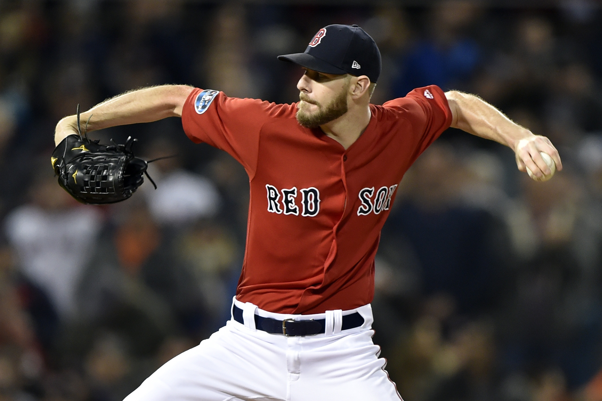
The Red Sox, like many teams in MLB, have stuck with a more traditional look. But unlike teams like the Dodgers, Yankees, and Tigers, the Red Sox have never been afraid to make their traditional uniforms a little more modern. Boston is one of the only teams that don’t use player names on the back of their home jerseys. The classic Boston font that says “Red Sox” on their home jerseys and “Boston” on their away jerseys represent the city well. The addition of the red and dark blue jerseys in the 2000s added a nice modern touch that the Sox wear mostly on weekends. Additionally, the classic “B” in the Boston font is one of the most recognizable logos in all of sports, but the alternate two-sock logo on the cap needs to make a comeback in the near future.
4. Pittsburgh Pirates

The Pirates have stuck with the Pittsburgh city color scheme of gold and black. Like other professional sports teams in their city such as the Steelers and the Penguins, the Pirates have made the black and gold color scheme really stand out. Adding two new jerseys to this season’s set, Pittsburgh has made the wordmark really stand out by implementing their custom script. The black uniforms are a favorite and the new sleek look makes the set really clean. The alternate Pirate logo on the sleeve is a nice touch. A gold jersey with the Pirates’ logo on the chest would be a great addition to this already awesome set.
3. Baltimore Orioles

The Orioles may be forgotten thanks to their abysmal play throughout the past couple of years but their uniforms are among the best in baseball. Using orange as a primary color, the Orioles’ home whites with the three-color panel hat matches perfectly. The orange alternate is what a team that has orange in their color scheme should look like. The alternate black with the script “O” on the cap is very intimidating. The old-school bird face logo is a mix of old-school and modern style that makes Baltimore’s uniforms look great. Not to mention their awesome Maryland pride uniforms worn once a year.
2. Oakland Athletics

The A’s have always had great uniforms. From the old-school kelly green and yellow to now the dark green and yellow, there’s just something about these uniforms that are money(ball). The use of yellow as an accent color is done to perfection in each of their uniforms. The best is their new kelly green alternate that looks traditional, but modern at the same time. Oakland should think about going with the lighter green as a permanent color. The thing that was most pleasing about the A’s uniforms in the early 2000s was when the team wore all-white cleats before it became popular. This is something that has been lost in the league since everyone has started to wear their own style of cleats but the all-white touch on the bottom has always looked pleasing.
1. Milwaukee Brewers

The Brewers absolutely killed the 2020 re-design. Adding the old-school glove logo that has the lowercase “m” and “b” to form the glove symbol has been the best logo in baseball since it was created. Making the glove logo the primary logo on each of the caps while adding pinstripes like the old-school royal blue Brewers uniform is a perfect touch. The light navy and gold stand out on the field and the off-white home uniforms go perfect with the color scheme. The light navy alternate with the gold writing will become a favorite of baseball fans everywhere. The navy and gold baseball logo on the sleeve as well as the state of Wisconsin logo with the modern “M” looks like it belongs. Well done, Milwaukee.