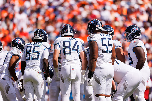
Logos. They give teams an identity, but what makes a logo good? In my opinion it’s engaging, intense and might have some city or historical references hidden in the details. These logos don’t have that. These are my top five worst National Football League logos of 2019.
No.5

The fifth worst logo in the NFL today in my opinion belongs to the San Francisco 49ers. This isn’t necessarily an ugly logo but rather unoriginal. No this isn’t the iconic Joe montano one that was used from 1968-1995 or the Steve Young era logo. This one was introduced in 2009. I think a more active logo like the original one used from 1946-1967. Yes, that one was corny, but at least it was trying to be interesting. Maybe a pickaxe and/old gold nugget could be used in the future.
NO.4

At No.4, I have the current Patriots logo. No, this is not me hating on New England. I’m just not a fan of the “Flying Elvis compared to the iconic “Pat the Patriot.” So what do I suggest for a new logo? Well I wouldn’t look to make a change until Brady and Belichick are retired. I think something with a militia man firing a football out of a cannon.
No.3
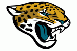
In the number three spot we have the Jacksonville Jaguars. When I see this logo I think Blaine Gabbert and Blake Bortles, which isn’t an elite club of quarterbacks. I like the intensity unused logos of 1993-1994. This one looks like it sucked on 20 blue lollipops (note the blue tongue) and a build-a-bear stuffed animal. Keep the shark teeth, but maybe make the new logo a full body of the animal.
No.2
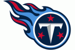
At the No.2 slot we have the Tennessee Titans logo. The name Titans doesn’t give a lot to work with, but a flying, flaming, T is not what I envisioned. Maybe use an ancient Greek Titan as a reference point. Maybe if this team was not the Oilers (who had an amazing lineage of logos) I would not be so annoyed. It has been 20 years guys, time to change the logo.
No.1

The worst logo in the NFL today is by far the Miami Dolphins current version of the dolphin jumping through a ring of fire or being in front of a sun (I can’t tell which it is).
When a similar logo was made in 2013 I was thinking ‘You know what, this might be an attempt at a modern logo?’
Guys, when you double down on the bright orange I just cringe. The main issue I have is where do you go from here? What do dolphins do that is intimidating? I’m not sure, I just think this is not it.

