Author’s note: This article is as scientific as four-year-old’s coloring book. Nothing discussed below should be taken with any sense of sincerity.
With that said, let’s take a look at the XFL’s logos.
Dallas Renegades: B+

I really like the shading on the eyes. It immediately reflects a sense of suspense and surprise surrounding the team. It is indicative of fear and a relentless attitude. It is a really smooth logo, and all three colors blend seamlessly. I have no qualms with the logo. The Renegades’ logo is quite the artistic expression, and it is visually-appealing in every manner. The Renegades couple their good logo with one of the better names in the XFL. Good job, Dallas.
DC Defenders: A++

Whereas the team name sucks, the Defenders’ logo is tremendous. With just two colors, the Defenders epitomize the city of Washington D.C. The crossed lightning bolts feel out of place, but it actually kinda works. The three stars are perfect in both style and representation of the city. It is an excellent design from top to bottom as the shield loosely relates to the name, and both the colors and stars harken back to the city. To top it off, a stylized “DC” at the bottom brings the logo to the highest grade I can realistically give.
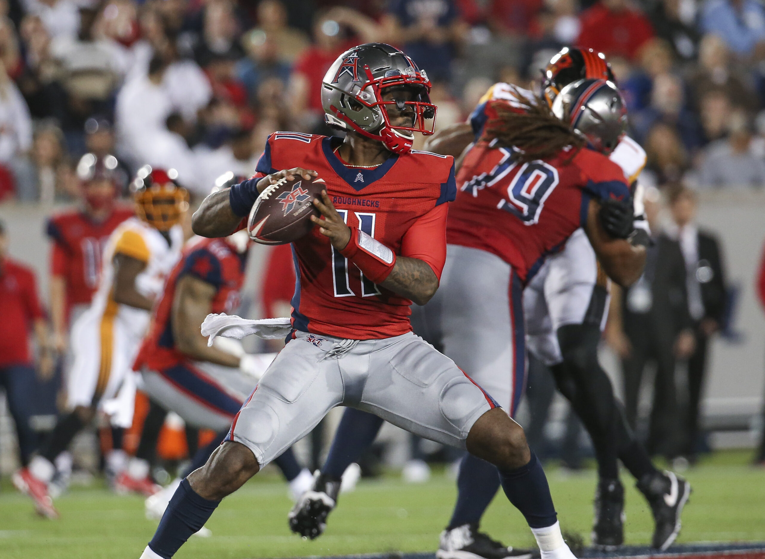
Houston Roughnecks: B-

Yes, the “H” makes sense. Despite all the sense it could possibly make, it is still tacky. It looks placed. While that seems like an odd criticism for a logo specifically made for the XFL, the “H” is unnatural. The logo does look nice, but the “H” keeps it from being on par with Dallas. The color scheme is alright, albeit slightly generic. The star on the top of the logo is a nice touch, and it is one of the main reasons why the logo is not lower in my estimation.
Los Angeles Wildcats: C

As much as I like the originality of the color scheme, the stylized “LA” is very generic and bland. If the logo was for baseball or was an alternate logo for the Wildcats, I think it would look very nice. However, if the logo is the main logo for the Wildcats, I think it lacks compared to the other seven. On the bright side, the logo is approximately 150 times better than the Los Angeles Xtreme logo from the initial installment of the XFL. This is the only logo that does not represent the name, and that irks me.
New York Guardians: C+

I don’t really follow the logo here. The logo doesn’t feel like a Guardian to me. With that said, the color palette is used well, but the real teeth seem off to me. The logo feels like a mad bunny ate a monochromatic Egyptian pharaoh. The logo feels demonic in a way, and I do not really jive with it. While it is scary, I do not think it fits the name in any way. The logo would be an “F” if it was forward-facing, so at least the Guardians did not do that.
St. Louis BattleHawks: B+

Oddly enough, I think this logo fits the Defenders more than the BattleHawks. Despite that quirk, the BattleHawks have a very well designed logo. The color scheme is smooth and effectively utilized with a base silver-ish color and navy accents. I have nothing to critique about the logo beside it probably fitting DC better with the Washington Monument-esque pillar in the center of the logo. The wings on the edges are a nice touch, and the sword as a whole is a nice design. It is a quality logo.
Seattle Dragons: B+

It is cartoonish. The colors are weird. The logo fits the name to a perfect match, and I believe that deserves some credit. The blending of green, navy, orange, and a darker green makes for an odd color palette, but it is not far off from the colors of the Seattle Seahawks, Mariners, and Sounders (besides the orange). It is a well-designed logo with acute details such as the orange eye or the white teeth. It is one of the better logos that the XFL has to offer.

Tampa Bay Vipers: A-

The Vipers have a tremendous logo. It is perfect in terms of being V-shaped in honor of the Vipers. The fangs on the inside of the “V” are well-designed. The Vipers are the only team that effectively utilizes the initial letter in their logo (sorry Houston and Los Angeles). The green and yellow are not perfect colors, but it is different from the rest of the league due to the lack of navy and red. It is a good logo without being over the top.
As a whole, the logos are really nice across the board.