Adrian Andrew | May 6th, 2020
There have only been three MLB relievers to have multiple 50 save seasons. Can you guess those three? Eric Gagne, Mariano Rivera, and Jim Johnson. Wait, what? Jim Johnson? Okay okay, maybe that wasn’t mind-boggling enough for you. Only two closers have ever recorded back to back 50 save seasons. The two men to accomplish that feat would be none other than Eric Gagne and… Jim Johnson.
Some of you may not even remember Johnson, while most of you know him as one of the worst relievers in baseball over the past few years. But the question I asked myself before delving deep into statistics is probably the same one you all are asking yourselves. How did Jim Johnson land himself in the record books with all-time greats, and MLB Hall Of Famers, but yet his career is so tarnished? Determined to get to the bottom of it I researched many websites, interviews, old clips, stats, graphs, etc. to answer this for myself and everyone else. I came up with a few probable reasons that in all likelihood were the combo that ruined Johnson’s “legacy”, and here they are.
Background
I’ll be honest here, getting started figuring out what went wrong with Johnson was incredibly difficult. When looking at his stats nothing pops out at you. Except for Johnson’s ERA and h/9 (hits per nine innings) which drastically increased. But that’s the thing. We already know that Johnson had a sharp drop off, that’s obvious. I was trying to prove why Johnson had a downfall and not state obvious facts. So I had to delve into some more advanced stats to find my answer.
But first, I wanna show Johnson’s basic stats and overview. Johnson was drafted by The Baltimore Orioles in the fifth round of the 2001 MLB Draft. Johnson made his debut in 2006 for the Orioles and would pitch three innings, allowing eight runs. That would be his only appearance for 2006. He then got called up again in 2007 and once again only had one outing where this time he would have the slight improvement of going two innings and allowing two runs.
If you look at his beginning it’s easy to see and expect failure, but Johnson had other ideas. Johnson came out in 2008 for the Orioles and threw 68.2 innings with a superb 2.223 ERA. But then once again Johnson in typical Jim Johnson had another down year in 2009. He followed that up with an average 2010 season. But in 2011 something changed. Johnson was finally consistent. He had a 2.67 ERA in 2011 and then followed that up in 2012 by becoming the Orioles closer, having an amazing 2.49 ERA, being selected to the All-Star Game, leading the league in saves with 51, and winning the A.L Rolaids Relief Man of The Year Award. In 2013 Johnson once again led the league in saves with 50 this time and a decent 2.94 ERA.
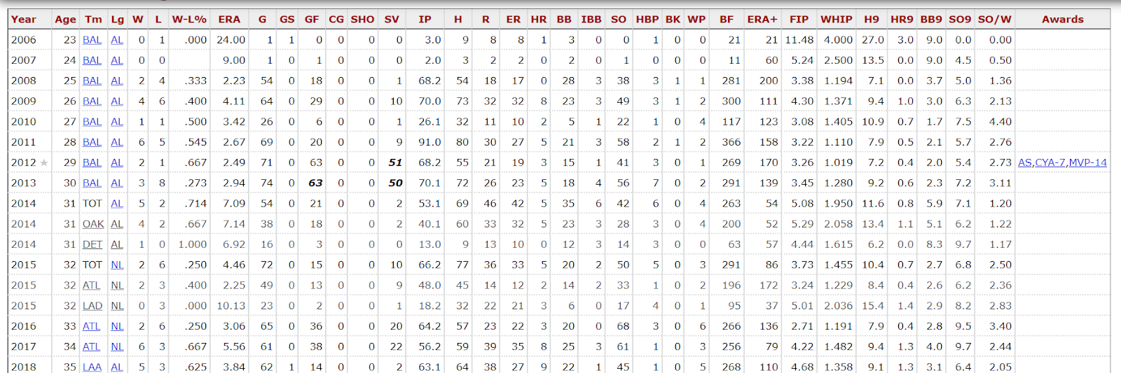
Long story short, the Orioles traded Johnson to the Oakland Athletics after the 2013 season to avoid paying him 10 million dollars. Things went downhill for Johnson fast after that, but I’ll let the stats from Baseball-Reference tell that.
As you can see Johnson had a massive drop statistically wise. Normal conventional stats didn’t provide me much help so I had to turn to more advanced stats and that still didn’t help until I got a big break.
gmLI
I was sorting through the stats, and although Johnson is and was very inconsistent that makes finding the issues easier in some ways. I could look at the differences in stats from one year to another and not have to factor age in because of how quickly it changed. While doing that process I saw Johnson’s “gmLI”. For those of you who don’t know what that is, gmLI or game-entering Leverage Index analyzes how much pressure there is on a reliever when he enters a game. 1.0 would be average pressure, below 1.0 would mean there isn’t a lot of pressure on the pressure (most likely winning by a lot) and above 1.0 would mean that there is more pressure on the reliever than the norm (most likely a close game, possibly runners on base).

This got me thinking, what was so different about Johnson with the Orioles and Johnson with the Athletics? Then it hit me. With the A’s Johnson wasn’t a closer like he was in his best seasons with the Orioles. That got me thinking about the pressures of being a closer versus a regular reliever, and sure enough in Johnson’s best three years with the Orioles, his season average gmLI was 1.45 in 2011, 1.81 in 2012, and 1.82 in 2013.
Then in his worst season ever in 2014 with the A’s as mentioned before he was just a reliever his gmLI was just .77, and his ERA was 7.14 over 40.1 innings pitched. Of course, all good data needs to be repetitive, and it did repeat itself.
Even back in the game, I said before in 2007 when Johnson pitched two innings giving up two runs the gmLI of that game was only .30.
Also, after Johnson’s rough start with the Athletics, he got traded to the Detroit Tigers. He did atrociously there as well with an ERA of 6.92 over 13 innings, and sure enough, his gmLI was low again at only .47. I decided to make a graph to show the correlation.

It’s not a total correlation but we are all human and humans are bound to have slight unexplainable inconsistencies. But for the most part, the graph is fairly aligned.
There was a possibility that my graph told a narrative. So I set about to disprove my point, in doing so I guessed that Johnson had a lower gmLI, because he was playing poorly. After all, he was trusted less because he was doing poorly, and therefore not put in intense close pressure situations.
But, I knocked out that counter argument real fast by looking at save opportunities and game logs. In 2014 (Johnson’s worst season) he was only given three save opportunities. Also, even in his worst season he still performed well when the pressure was high and when more men were on base.
After examining that data I don’t think it’s far fetched to assume that Johnson feeds off adrenaline. It’s possible that when Johnson’s back is up against the wall and it’s solely him trying to battle it out to put his team in the win column he kicks it into another gear.
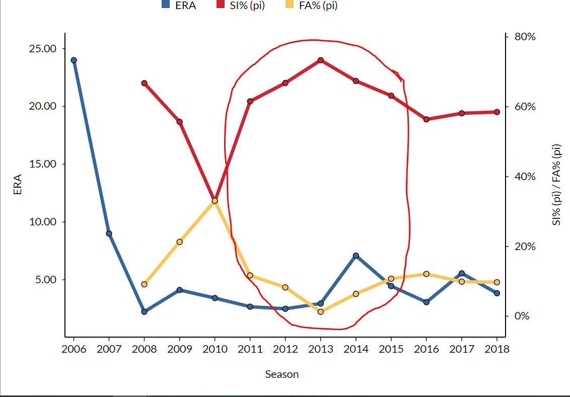
Pitch Selection
As I stated earlier, not many of Johnson’s advanced stats changed from his best year to his worst year. It seemed while his ERA was inconsistent the way Johnson went about pitching didn’t change much. That was until I looked at his pitch selection.
This one isn’t the biggest change ever but in Johnson’s 2013 season which was one of his best he had a career-low percentage of fastballs thrown. For reference, Johnson’s career average fastball thrown percentage is 11%. In 2012 he threw 8.3% fastballs, and in 2013 threw only 1.3% fastballs.
Now in these years what did Johnson substitute the fastball with? A nasty sinker. Johnson’s career average for the percentage of sinkers thrown is 61.6%. However, in Johnson’s prime years of 2012 he threw 66.8% sinkers, and then in 2013 threw a career-high 73.4% sinkers!
Then in 2014 (Johnson’s worst year) his fastball percentage went back up to 6.4%, and his sinker percentage went down to 67.4%.
Here’s a graph I whipped up on FanGraphs showing pitch percentages over Johnson’s career and how it influenced his ERA.
This trend continues today. Another advanced stat backs this idea up as well, and that would be wFA/C and wSI/C. This stat measures how effective a pitch is. It tells us how many projected runs a pitcher would give up if he threw that pitch 100 times. A negative value is bad, and a positive value is good.
With that in mind take a look at Johnson’s career wFA/C meaning fastball, and wSI/C meaning sinker, and especially look at the career averages.

As you can see Johnson’s only pitch with a career average of a negative for this stat is the fastball. So by using this stat, we can easily assume that Johnson’s fastball is his worst pitch. Then if this is true why did he start to favor it in the years after his best two years? Maybe a new team and the catcher’s preferences changed? His sinker even had a negative value in 2014. This led me to my final point.
Pitch Location
The weighted pitch statistics mentioned above led me to ponder why Johnson’s sinker and fastball became so bad in 2014. So I went back over to FanGraphs and looked at some heat maps of how his pitch location changed in his good years into his bad years.
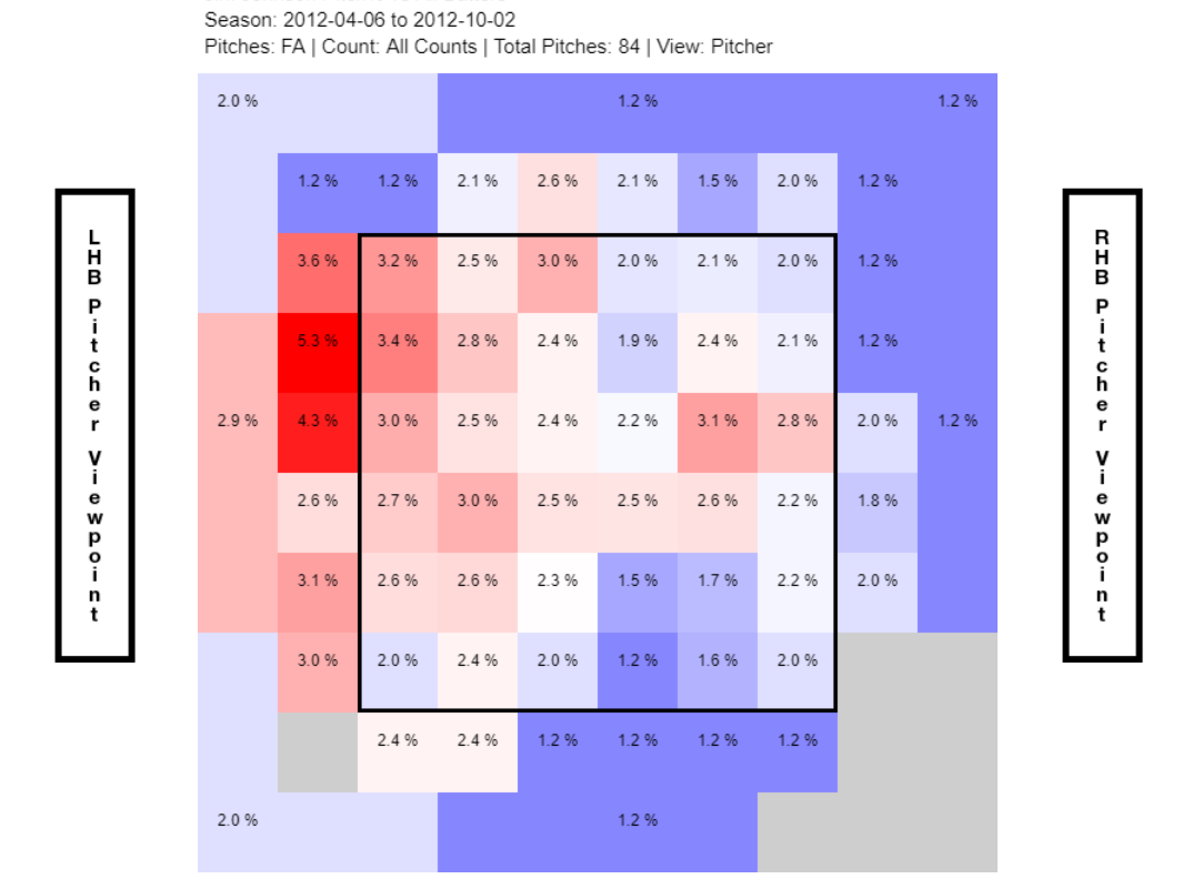


Those heat maps are in chronological order. The first from 2012, then 2013, and then the awful 2014 year. You can see a shift in where pitches are located by looking at the heat maps.
2012 – The pitches were very spaced out and Johnson seems to hit the target on the black of the strike zone.
2013 – Johnson started to work the strike zone more but still spaced his pitches out in the strike zone often.
2014 – The first bad year johnson had after great years he started to hit the same spots in the strike zone often.
It’s quite easy to assume that Johnson’s failure came due to poor pitch location. You can’t keep throwing the ball in the same spots and expect to fool batters. Johnson also had more walks in 2014 than any other year in his career, and you can even see by the heat maps that Johnson began to favor the very end corners outside the strike zone in the map. That trend continued and got worse over time in seasons following the 2014 shifts.
Conclusion
Jim Johnson was a big flame-out, but that’s baseball for you. After his best seasons, he got traded away and had his closer role stripped. This put him in positions with less stress and pressure. For a former closer who may live off the adrenaline, it seems that hurt his performance. Johnson also started to get away from his sinker and started throwing his fastball which has always been inefficient over his career.
To top it all off the location of his pitches started to become one dimensional, and to avoid that, he went farther and farther out of the zone resulting in more walks. It’s basic baseball that the more hits, home runs, and walks you give up the more runs you will give up, and all of these factors created an increase in those three effectively raising Jim Johnson’s ERA, tarnishing his career, and leaving us asking “what could have been?”
Questions and comments?
thescorecrowsports@gmail.com
Hit us up on the Socials:
Twitter@thescorecrow
Reddit at u/TheScorecrow
Facebook at The Scorecrow
Instagram at The Scorecrow
Check out our Facebook Group where you can read and post articles at The Scorecrow
Reddit Group where everyone can post without fear of being banned at The Scorecrow
Follow Adrian Andrew on Twitter @FFBKnight
Main Credit Image: Embed from Getty Images