The Tampa Bay Buccaneers set social media ablaze last week when they released a teaser video that strongly suggested newly-designed uniforms would be released this offseason.
The video was littered with hints and clues in the form of old newspaper clippings. Headlines such as “Uniform effort”, “Return to glory”, and “Bucs new uniforms mix old with new” decorated a mosaic being composed by a street artist in the video.
The final product revealed a re-worked version of the team’s beloved pirate ship as its centerpiece spray-painted in the team’s blood red, a seemingly greyer version of pewter, and even a touch of the classic creamsicle orange.
This, of course, set off rampant speculation regarding everything from possible logo changes to a potential return to creamsicle-esque uniforms from the team’s origins.
Now, a week after the teaser release, the Buccaneers’ official twitter account released a pair of wallpapers. The backgrounds featured colorless stencils of flags adorning the current skull and crossed-swords logo being run onto the field as is tradition before the start of every home game. The pictures can be seen here below:
Fresh wallpapers for 📲 & 💻
⚪️ #WallpaperWednesday ⚪️ pic.twitter.com/IKUnNjaPfw
— Tampa Bay Buccaneers (@Buccaneers) February 19, 2020
It certainly wouldn’t make sense for the team to release these for fans to use as backgrounds on their device of choice if a logo change was soon to be revealed. Therefore, this confirms the helmet logo will likely remain the same.
The Buccaneers marketing department appears to be engaging in a trickling rollout of breadcrumbs hinting at what we can expect to see in the coming new designs.
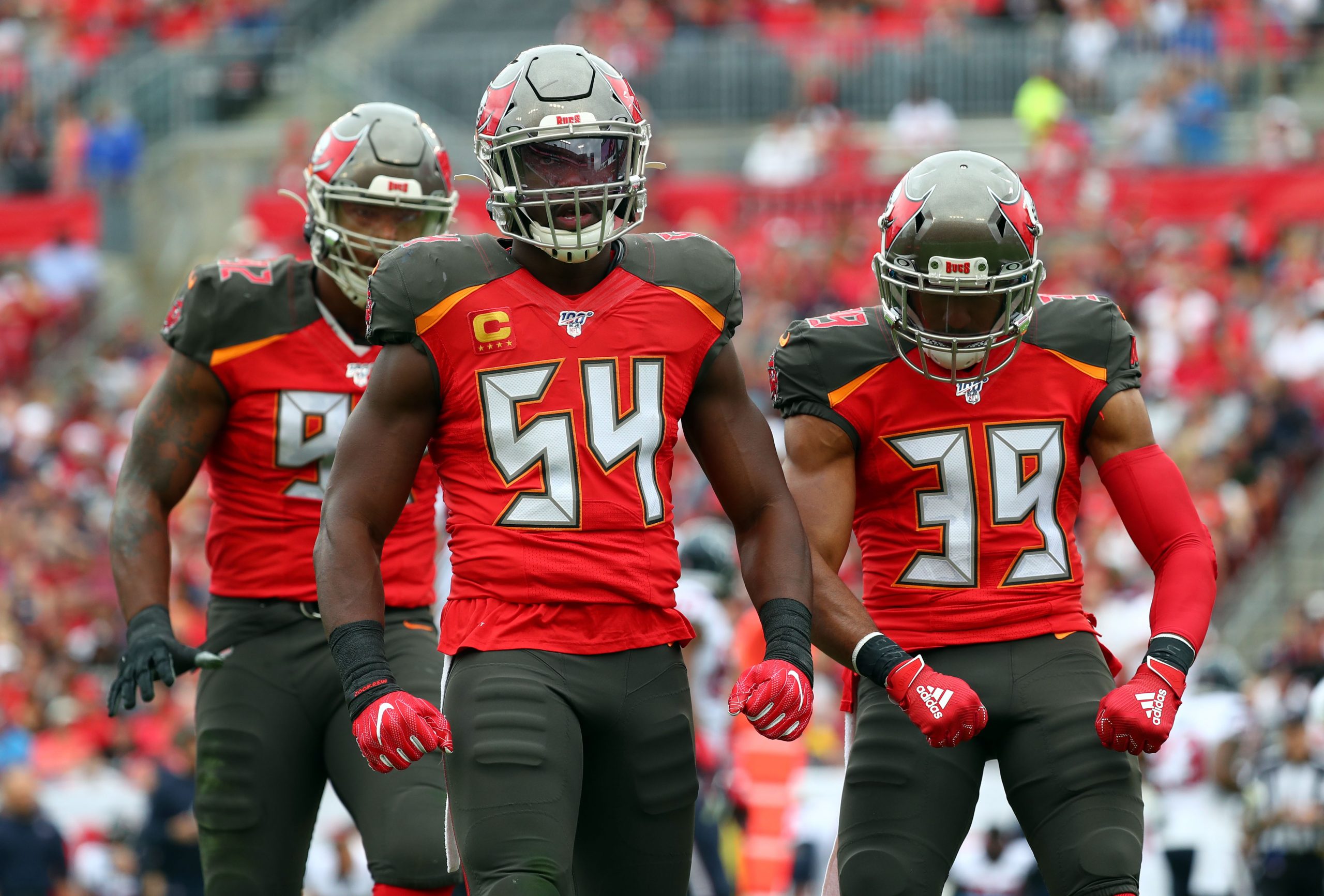
The teaser video from last week was also sure to focus on newspaper headline photos featuring the Super Bowl era uniforms while hoisting the Lombardi trophy. Today’s tactical tweet seems to further confirm that the new designs will lean heavily on the previous iterations that were largely beloved by fans.
One thing that still isn’t clear is the color palette and distribution. While last week’s teaser depicted primarily the familiar red it also showed a pewter color that looked less copper/brown and more grey than the previous and current editions.
Then, there is the issue of the creamsicle spot near the hull of the ship. That, combined with the headline, “Tampa Gets NFL Franchise For ’76” and the aforementioned “mix of old and new” sure sounds like creamsicle orange will be more heavily incorporated than it was in the Super Bowl era design where it only appeared as an accent stripe on the pants and stroke outline on the numbers.
This leads me to believe the colorless wallpapers released today were done so deliberately. It appears they will certainly be including the classic orange and possibly at a much more prominent level than before. There could even be alternate third versions to be used on special occasions, as was the case with the creamsicle throwbacks before the NFL helmet safety rule forbid the use of alternate helmets.
In recent years, new uniforms have been unveiled in the days leading up to April’s NFL Draft so likely we will have to wait until then to see the final product. Until then, let the gleeful speculation and super-sleuthing continue.






One Response